
Signs Your Podcast Cover Art Needs an Update
- Josh Wilhelm
- Mar 10
- 4 min read
Podcasts live or die in the scroll. When someone is browsing shows in apps like Apple Podcasts or Spotify, your cover art is often the very first thing they see before deciding whether to learn more about your show. In many cases, it’s the only visual element representing your podcast in crowded directories full of competing content.

You can have incredible audio, great guests, and a well-produced show, but if your artwork doesn’t catch someone’s attention while they’re scrolling, they may never give your podcast a chance. That’s why podcast cover art isn’t just decoration—it’s a critical part of how your show is marketed and discovered.
If you’ve never revisited your cover art since launching your podcast, or if you’re unsure whether it’s really working for you, here are a few signs it might be time for an update.
1. You Can’t Read It Clearly on Your Phone
Podcast artwork is typically designed at a large size, but listeners almost never see it that way. Instead, it’s displayed as a small thumbnail while people scroll through podcast apps on their phones. When artwork is reduced to that size, design decisions that seemed fine during creation can suddenly become difficult to read or recognize.

If your podcast title disappears, blends into the background, or requires someone to squint to figure out what it says, that’s a problem. Listeners usually won’t take the extra time to decode a cover image—they’ll simply keep scrolling. Effective podcast cover art prioritizes readability and clarity, making sure the title and main elements are instantly recognizable even at a small size.
2. Your Show Has Evolved… But Your Cover Hasn’t
Many podcasts grow and change over time. You may have refined your niche, improved your production quality, or shifted your focus as you learned more about your audience. These changes are a natural part of building a show, but they often leave the original cover art feeling disconnected from what the podcast has become.
If your artwork still reflects the earliest version of your show, it might no longer represent the level of professionalism or clarity you’ve achieved. A podcast that has matured in its content, direction, and audience deserves visuals that reflect that growth. Updating your cover art can help align your branding with the podcast you’re producing today, rather than the one you launched months or years ago.
3. There’s Too Much Going On
One of the most common challenges in podcast artwork is trying to include too much information. Multiple fonts, busy backgrounds, extra graphics, and long titles can quickly create visual clutter that makes it difficult for viewers to process what they’re seeing.
Good design prioritizes simplicity and focus. When a cover image tries to communicate too many ideas at once, the core message often gets lost. Some of the most effective podcast covers succeed precisely because they are simple and intentional. They focus on a clear title, a strong visual element, and a design that remains readable and recognizable even at smaller sizes.
4. It Looks Like Every Other Podcast
Spend a few minutes browsing podcasts in your category and you’ll probably notice certain visual trends repeating again and again. Microphones, headphones, generic gradients, and stock photos are common design choices that many creators gravitate toward.

While there’s nothing inherently wrong with these elements, relying on them too heavily can make your podcast blend in with dozens of other shows. When artwork feels generic or interchangeable, it loses its ability to stand out. Distinctive design helps listeners remember your show and recognize it quickly when they encounter it again in their feed.
5. It Feels DIY (Even Though Your Show Isn’t)
Most podcasts begin with a DIY mindset. Creators experiment, learn new tools, and figure things out as they go. That’s part of the fun of starting a podcast. However, many shows eventually reach a point where the content has become much more polished than the visuals representing it.
If you’ve invested time and energy into improving your equipment, refining your format, booking better guests, or growing your audience, your cover art should reflect that same level of care. Design plays a powerful role in shaping first impressions. Before someone hears a single word of your show, your artwork is already communicating something about the quality and professionalism of your podcast.
What Makes Podcast Cover Art Clickable?
Effective podcast cover art does more than simply look good—it communicates quickly and clearly. When listeners are scanning through dozens of shows, they’re making snap judgments based on visual cues. Strong artwork helps your podcast stand out by making those cues easy to understand.
Clear titles, strong contrast, and a focused visual identity all contribute to artwork that performs well in podcast directories. The goal is to create something that is immediately readable, visually distinctive, and aligned with the subject of your show.
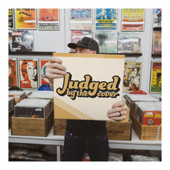
Through my design work and the many conversations I’ve had exploring album artwork on Judged by the Cover, one thing has become clear: visual presentation influences perception more than most creators realize. Podcasts may be an audio medium, but they exist in a very visual environment when it comes to discovery.
Final Thought
If your podcast has grown over time but your cover art hasn’t evolved with it, it may be worth taking a step back and reevaluating how your show is being presented visually. As podcasts develop, hosts often improve their content, refine their message, and invest in better production quality. When that happens, the artwork representing the show should reflect that same level of growth and professionalism.
Great podcasts deserve cover art that not only looks good, but also communicates clearly and stands out in crowded podcast directories. Thoughtful, intentional design can make a meaningful difference in how listeners perceive your show and whether they decide to give it a try.


If you’re curious whether your current cover art is doing its job, feel free to send it my way. I’m always happy to take a look and offer some honest feedback.


Comments