
In a World of AI Perfection, The Rolling Stones Chose Something Human
When Phil first told me that The Rolling Stones had a new album coming out, my honest reaction was, "Wait... really?" Not because I don't respect the band. Quite the opposite.
It's just hard to imagine a group that formed in 1962 still creating new music over sixty years later. Most artists eventually fade away, retire, or become legacy acts that simply tour their greatest hits. The Rolling Stones, however, continue to do something few artists ever accomplish...they're still creating.
Their latest album, Foreign Tongues, surprised both of us. Not only because of the music, but because of the artwork that introduces it.
As we discussed on this episode of Judged by the Cover, the cover art isn't polished, perfect, or conventionally beautiful. In fact, it's intentionally the opposite. And I think there's an important lesson in that for every independent artist preparing to release music today.
An Album Cover That Doesn't Try to Be Perfect
The cover of Foreign Tongues immediately catches your attention, but probably not for the reasons you'd expect.

Instead of another heavily composited photograph or glossy digital illustration, The Rolling Stones commissioned American painter Nathaniel Mary Quinn to create an original pastel portrait. The piece blends recognizable features of the band members into one fractured, weathered face. It's abstract. It's uncomfortable. Some fans have even described it as ugly.
Ironically, that's exactly what makes it work.
The artwork wasn't designed to present The Rolling Stones as untouchable rock icons. Instead, it reminds us that they're human. After six decades of touring, recording, and performing, they've accumulated scars, stories, and imperfections. Rather than hiding those realities, the artwork embraces them.
Even Mick Jagger reportedly joked about the character on the cover being "Mr. Ugly," while still praising the decision to use an actual painting instead of computer-generated artwork.
That decision speaks volumes.
The Cover Matches the Music
One of the things that impressed me most after listening to the record was how closely the visual direction matched the music itself.
The album wasn't built around polished perfection. Instead, the band recorded many of the songs live in long takes, allowing natural imperfections to remain. Rather than editing every note into place, they leaned into the chemistry that comes from musicians playing together in the same room.
You can hear it.
The guitars feel raw. The performances have energy. The blues influence that's always been part of The Rolling Stones' identity is still front and center, and those little imperfections actually make the songs feel more alive.
That's the same feeling the cover art communicates before you ever press play.
Good album artwork doesn't simply decorate the music, it prepares the listener for the experience they're about to have.
What Independent Artists Can Learn
As someone who designs album covers for independent musicians, I think it can be easy to fall into the trap of asking, "What does everyone else look like right now?"
But that's often the wrong question. The better question is, "What honestly represents this music?"
There are incredible AI tools available today. There are thousands of templates. There are design trends that come and go every year. None of those things are inherently bad. But if your artwork only follows trends, it risks looking like everyone else's.
The Rolling Stones could have created another clean, polished digital cover. Instead, they hired an artist whose style reflected the emotional character of the album.
That choice made the project feel timeless.
Your artwork doesn't have to imitate someone else's success. It should communicate your own story.
Authenticity Is Becoming More Valuable
It's interesting to watch what's happening across creative industries. As AI-generated content becomes easier to produce and digital tools continue making everything cleaner and more perfect, audiences seem to be craving the opposite.
We're seeing renewed interest in vinyl records.
Film photography continues to grow.
Live performances remain more meaningful than ever.
Even CDs, which many people assumed were gone for good, appear to be finding new life among collectors and independent artists.
Why?
Because people still want something real. They want something they can hold. Something with texture. Something created by another human being. That same principle applies to your branding. Perfection doesn't always create connection.
Authenticity does.
Create Something That Looks Like You
One of my favorite moments from our podcast discussion came when Phil asked a simple question:
"Would you tell a painter to stop creating because they're 82 years old?" Of course not.
Artists create because that's who they are. The Rolling Stones aren't trying to compete with younger bands or reinvent themselves to fit today's trends. They're simply continuing to tell their story the way they've always told it.
There's a lesson in that for all of us.
Whether you're releasing your first single or your tenth album, don't chase whatever design style happens to be popular this month. Instead, ask yourself what your music actually feels like—and create artwork that reflects that. Because the best cover art doesn't just get attention.
It tells the truth.
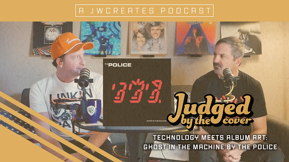
If you'd like to hear our full conversation about The Rolling Stones' Foreign Tongues, including our thoughts on the music, the artwork, and why we think physical media is making a comeback, be sure to check out the latest episode of Judged by the Cover.
And if you're planning your next release, I'd love to help create artwork that tells your story.
Every great record deserves a cover that's just as memorable as the music inside.


Comments