
Michael Jackson’s Thriller — All Thriller, No Filler (Why It Changed Everything)
- Josh Wilhelm
- 1 day ago
- 3 min read
When people think of Thriller, they usually think about the music first...and for good reason. It’s one of the most successful and culturally impactful albums of all time. But at Judged by the Cover, we’re here to talk about something just as important: The image.
A Cover Built on Confidence
At first glance, the Thriller cover feels simple.

Michael Jackson, dressed in a white suit, reclined in a poised, almost effortless position. Clean background. Minimal distractions. A soft glow that almost gives him a halo.
But the simplicity is what makes it powerful.
There’s a quiet confidence in the image. It doesn’t scream for attention—it commands it.
This isn’t an artist trying to prove something.This is an artist who already knows. And that pose...the way he’s positioned, relaxed but in control, tells you everything you need to know before hearing a single note.
The Story Behind the Shot
The cover was photographed by Dick Zimmerman, a photographer known for his polished celebrity work. What’s fascinating is how the look came together. Instead of selecting a wardrobe from a rack of styled options, Michael Jackson chose to wear Zimmerman’s own white suit. Same build, same fit...it just worked.
That decision adds an unexpected layer to the image. Something that feels iconic and meticulously planned… was, in part, instinctive. And that instinct paid off. The result is one of the most recognizable album covers of all time.
More Than a Photo — A Persona
Everything about this cover reinforces the identity Michael Jackson was stepping into during this era.
Polished, but approachable
Stylish, but not overdone
Controlled, but still human
There’s also something cinematic about it, which aligns perfectly with the direction of the album itself. This wasn’t just music, it was an experience. A visual and sonic world.
You can feel that even in a still image.
The Pose: Familiar, But Elevated
Here’s where things get really interesting. That iconic Thriller pose?It wasn’t entirely original. In fact, several artists around the same time used a very similar reclining, fashion-forward pose on their album covers.


Teddy Pendergrass – It’s Time for Love (1981)
Lionel Richie – Lionel Richie (1982)
Luther Vandross – Give Me the Reason (1986)
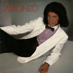
Alfonzo - [1982]
All of them feature:
A relaxed, reclined posture
Clean wardrobe styling
A focus on presence and personality
So the question becomes: If the pose wasn’t unique… why does Thriller stand above the rest?
Execution Is Everything
The difference isn’t the concept. It’s the execution. Where other covers feel like portraits… Thriller feels like a statement.
The lighting is softer and more intentional
The styling is timeless instead of trendy
The expression feels effortless, not forced
The composition gives the image room to breathe
There’s also a level of precision that matches the music itself. Every detail feels considered, even when it appears natural. And that’s what elevates it. Because in design, and especially in album art, familiar ideas can still become iconic when they’re executed at the highest level.
Final Thoughts
Thriller is often described as a perfect album. And while the music absolutely lives up to that reputation, the visual side deserves just as much credit.
Because this cover proves something we talk about all the time: A great album deserves a great image.
And when those two things come together at the highest level…you don’t just get a release.
You get a legacy.


Comments