
Judging the 2025 Grammy's Best Album Cover Nominees, and What They Can Teach Us About Album Cover Design
- Josh Wilhelm

- Feb 20
- 5 min read
Updated: Mar 3
For the first time in 68 years, the Grammys added a category specifically for Best Album Cover. In a world where most of us experience music through a thumbnail on our phones, that feels long overdue.
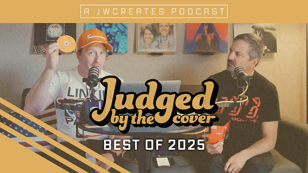
On our most recent episode of the Judged by the Cover podcast, Phil and I sat down to discuss the nominees. We already knew who won, but we were curious about a bigger question: What does this first class of nominees tell us about the future of cover art?
Let’s walk through them.
Chromakopia — Tyler, the Creator (Winner)

From an album cover design standpoint, this one makes sense as the winner. The image is sepia-toned and vintage. Tyler stands front and center, wearing a mask of his own face. The tone feels film noir—slightly unsettling and completely intentional. There’s no loud typography, no decorative elements, and no explanation.
Just concept. That’s why we think it works.
The strongest album artwork doesn’t rely on trends; it relies on identity. Tyler is known for building full eras and personas around his projects, and this cover reflects that perfectly. It feels like part of a larger artistic vision, not just a photo chosen at the last minute. In terms of Grammy-level album cover design, this is concept-first and decoration-second.
The Crux — Djo

If Chromakopia is restrained, The Crux goes in the opposite direction. This album cover is packed with visual storytelling. It features a hotel scene filled with people arguing, hanging out of windows, climbing out of manholes, and a plane flying overhead with a banner. It feels like a frozen movie moment.
Joe Keery—known to many from Stranger Things—clearly leaned into something cinematic here. The artwork feels staged on a studio backlot. It’s layered and maximalist, rewarding you for looking longer.
From an album artwork design perspective, this is powerful because it creates curiosity. In a streaming environment, that matters. If someone pauses on your thumbnail for even two seconds longer, you’ve already won half the battle.
This was easily both of our personal favorites among the nominees. It proves that detailed album cover design can still work in the streaming era—if the concept is strong and the composition holds together.
Debí Tirar Más Fotos — Bad Bunny

Two white plastic chairs under a banana tree—that’s the entire album cover.
Minimalism can be incredibly powerful in album cover design. Negative space, symbolism, and restraint are legitimate creative choices. Conceptually, this artwork is meant to be a love letter to Puerto Rico. There’s absence in the image, stillness, and memory.
But here’s the tension in modern album artwork: Minimalism only works if the idea hits hard enough to carry it.
In a feed full of bold colors and high-contrast imagery, subtlety becomes risky. If you don’t already know it’s Bad Bunny, there’s very little pulling you in at thumbnail size.
From a design standpoint, this cover raises an important question for independent artists: Is your minimalism intentional or just underdeveloped?
Glory — Perfume Genius

This album artwork feels like modern fine art photography. A body sprawled awkwardly across the floor of what looks like a trailer home. Sharp lighting and controlled tone create ambiguity in the scene. You’re not sure what happened—and that uncertainty is part of the concept.
From an album cover design perspective, this works because it creates tension. It makes you pause and ask questions. At the same time, it feels familiar. Conceptual photography like this has existed in gallery spaces for years. So while it’s executed well, it doesn’t necessarily feel groundbreaking.
Whether it connects emotionally probably depends on the listener.
Moisturizer — Wet Leg

This cover leans hard into shock. Exaggerated expressions, long nails, and a deliberately grotesque tone. The band has said they wanted it to feel unsettling—and they accomplished that.
But here’s something I’ve learned in album cover design: Shock grabs attention. It doesn’t automatically build longevity. There’s a fine line between bold and alienating. When album artwork leans too heavily into provocation without deeper conceptual grounding, it can feel temporary rather than timeless.
Some fans will love it, while others won’t. That’s the risk you take when your design strategy is built around discomfort.
What Stood Out

When you look at all five covers together, one thing jumps out immediately: Almost none of them use text. No big artist name. No album title dominating the layout. Just image.
That’s bold.
It tells me the Academy is rewarding strong visual identity over decorative design. They’re looking for covers that feel iconic—not just informative. That doesn’t mean every independent artist should strip their name off their cover tomorrow. Brand recognition still matters, especially when you’re building from scratch.
But it does raise the bar.
Is your cover strong enough to stand on its own? The other thing I noticed is this: the covers that worked best felt aligned with the artist’s persona. Tyler’s cover feels like Tyler. Joe’s feels cinematic and layered. The weaker ones, in my opinion, either relied too heavily on minimalism without enough emotional punch or leaned so far into shock that connection got lost.
Strong concepts win every time.
The Future of Album Art
The addition of the Best Album Cover category at the Grammys marks a significant shift in how we view music and its presentation. As we move further into a digital age, the visual representation of music becomes increasingly important. The album cover is often the first interaction a listener has with an artist's work. It sets the tone and context for the music that follows.
The Importance of Visual Identity
In today's music landscape, a strong visual identity can be just as crucial as the music itself. Artists must consider how their cover art reflects their brand and message. A memorable cover can create a lasting impression and draw listeners in. It can elevate the music experience and make it more engaging.
Trends in Album Cover Design
As we analyze the nominees, it’s clear that trends in album cover design are evolving. While some artists embrace minimalism, others opt for maximalist designs that tell a story. The key is finding a balance that resonates with the audience. The best covers are those that align with the artist's vision and connect with listeners on an emotional level.
The Role of Streaming Platforms
In a streaming-first world, album covers must compete for attention in a crowded digital space. Thumbnails are often the first point of contact, making it essential for artists to create eye-catching designs. A well-executed cover can lead to increased streams and engagement, making it a vital part of an artist's marketing strategy.
Final Thought
I love that the Grammys finally carved out space for album cover art. In a streaming-first world, that square is the doorway. It’s the handshake, the billboard, the first impression. If you’re releasing music right now, your cover isn’t an afterthought; it’s part of the story you’re telling.
Make it intentional. Make it aligned. Make it something people want to look at twice. If you’re working on a cover and want to build something that actually stands out, I’d love to help.
Let’s create something worth remembering.


Comments