
What Would JW Do...? Creating Real to Reel Cover Art
- Josh Wilhelm

- Sep 2, 2025
- 2 min read
In this episode of Judged by the Cover, Phil Hyland takes us on a nostalgic journey through his musical past. He shares the story behind "Reel to Real," a collection of 90s demo recordings recently brought back to life. Josh from JW Creates details the creative process behind the album artwork, incorporating weathered textures and Phil's handwriting to capture the essence of the era.
Creating Real to Reel - Resurrecting 90s Tapes: A Journey Through Album Art and Nostalgia

Phil Hyland, frontman of the 90s band Girlfriend, recently embarked on a project to breathe new life into old demo tapes. With the help of graphic designer Josh from JW Creates, these forgotten gems are now available as "Reel to Real" on streaming platforms.
"I didn't want these things on tape to just decay," Phil explained. "I'm staring at a stack of like 150 pounds of reel to reel tapes in front of me. I don't want to lose that stuff."
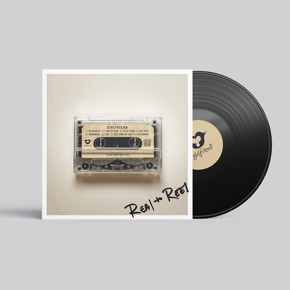
The process of bringing these demos to the digital age wasn't just about preserving the music. It was about capturing the essence of an era. Josh's design for the album art perfectly encapsulates the 90s vibe, featuring a prominent cassette tape image and a weathered, vintage look.
"I love it. It's got such a warmth to it," Phil remarked about the design. "It's almost like a museum look in a way. Like, oh, this is like an artifact."
The project also led to some unexpected reconnections. Phil shared, "It got me back in touch with Woody, our original drummer. He hadn't heard this freaking tape since he played on it."
Nostalgia played a significant role in the creation of this album. Phil reminisced about the days of Walkmans and the excitement of owning a physical album. "I felt like, oh, man, I own this record. And I'd be on the New York City subways just with my headphones on, going to an audition, just digging whatever album I was into."
In a surprising turn of events, Phil received a fan mail from a 15-year-old who had discovered Girlfriend's 1999 album. The young fan had filled out and mailed in a perforated card that was part of the original CD packaging - a relic of pre-internet fan engagement.
"We got a call from New York saying, hey, we got this postcard here. Like, you know, it's from the girlfriend fan club," Phil shared. This unexpected connection bridged a 30-year gap, showcasing the enduring power of physical media and thoughtful album packaging.
Key Takeaways from the Album Art Design:
1. Authenticity: The design incorporates actual handwriting for the album title, adding a personal touch.
2. Texture: Josh emphasized the importance of adding texture to create depth and a weathered look.
3. Balanced composition: The inclusion of both the band logo and production company logo brings visual balance to the design.
4. Font selection: A textured font was chosen to mimic the look of printed text on aged paper.
5. Color palette: A faded yellow background enhances the vintage aesthetic.
6. Prominent imagery: The cassette tape takes center stage, immediately conveying the album's concept.
This project serves as a testament to the enduring appeal of physical media and the power of thoughtful design in bringing music to life across generations.


Comments