
Judged by the Cover - London Calling
- Josh Wilhelm

- Oct 2, 2023
- 10 min read
Updated: Mar 3
On this episode of the Judged by the Cover podcast, we look at the iconic album London Calling by The Clash, and I also have quite the treat of an album cover for my Near Miss segment. Listen below and view the digital content below.
Welcome back to another episode of the judged by the cover podcast, brought to you by JW Creates. Judged by the Cover is a proud member of the PodNooga Network, so make sure to follow Podnooga on facebook and instagram, or find us on the web at podnooganetwork.com
On todays episode we are going to be looking at an album cover with a little controversy to it. Did they steal the cover art concept…? Did the photographer want their photo to be used for the cover…? Did they have the date of the photo wrong for decades…? This and more coming up in just a second….
But first if you haven’t already please make sure to go and subscribe to the podcast on your favorite podcast platform, if you are unsure what that means ask google. Also if you are listening on Apple Podcasts please take a minute and leave a review for the show. Reviews are very helpful in people being able to discover the show, but also make sure to share this episode and podcast with your friends, co-workers….or even your enemies….because they may like cover art and music stories.
With all the official podcast stuff out of the way…lets jump into todays album cover!! Today’s album cover has been regarded as one of the best album covers of all time, the album itself is regarded as one of the best albums of all time…and the story behind the cover shot is pretty legendary. The album we are talking about is London Calling by the Clash

The Clash was an English punk rock band that formed in London in 1976, and contributed to the post-punk/new wave sound that emerged out of England during this time period. Their sound employed elements from a variety of genres including reggae, dub, funk, ska, and rockabilly. I don’t know about you but I would have never expected the words Rockabilly reggae and Punk to ever be connected together…but that’s The Clash. Like most in the punk rock world, their music is very energetic or angry, and cover a broad range of political and cultural topics.
London Calling was their third studio album, and was an experimental album that explored different sounds and topics. The album was released on December 14th 1979 in the United Kingdom, and wasn’t released in the US until January of 1980. Fun fact, because of this staggered release dates, this is one of the only albums to ever be honored as the greatest album of two different decades. This album experienced chart success in both the UK and in the Us, and is certified platinum in the US. This was also the album that skyrocketed the popularity of the band in the US.
The Cover
As I alluded to in the intro, the cover art for London Calling may have a little bit of controversy to it… but let’s start by talking about the cover design itself. The front cover for the album features a black and white photograph of the bass player Paul Simonon smashing his Fender P-Bass into the stage floor at the Palladium theater in New York City. This once in a lifetime shot was captured by photographer Pennie Smith, who was the touring photographer with the band at the time. It may be hard to believe but this photo was not staged, it was a perfectly captured moment of frustration. I have seen some conflicting reports as to why he smashed his beloved guitar, but Paul shared this version of the story in an interview with Fender…

“I was sort of annoyed that the bouncers wouldn’t let the audience stand up out of their chairs. So that frustrated me to the point that I destroyed this bass guitar. Unfortunately you always sort of tend to destroy the things you love.” - Paul Simonon
So the bouncers weren’t letting the fans stand, which lead to a very dull and uninterested looking crowd…which lead to the bass players favorite guitar getting smashed into the floor. He also made a comment in another interview that he wished he would have thought this through, and took out his frustrations on his other guitar, but not a lot of thinking happens in the heat of the moment. Fun side note the smashed guitar is now on display at the Museum of London, and also spent some time in the rock n roll hall of fame.

Though this image perfectly incapsulates the energy of the music, the band and this album…the photo almost didn’t get used. In fact the photographer pleaded with the record company and the band to use a different image because this photo was blurry and slightly out of focus. Pennie took the shot as she was backing away, so as to not get hit by flying debris, thus creating this blurry shot. To this day she feels Luke warm about her most well known image. In an interview in 2003 she said…
“It’s very pleasant to be praised, but I can’t see that picture now. It’s been used in various forms so many times that it’s a bit like wallpaper. Of all the Clash photos I took, there are others that perhaps I prefer, for all sorts of reasons…".
Continuing on with the cover design, laid on top of the photograph we have the album title London Calling in a hand drawn looking font. London is on the right hand side going from top to Bottom in pink, with Calling in green at the bottom going from left to right. Also we have the band name in white in a basic sans serif font in the top just to the right of the other text. Overall the design of the cover is pretty basic…but some of you eagle eye music lovers might be thinking that this font and layout look familiar…. The layout, colors, and font style are almost identical to the cover art for Elvis Presley’s self titled debut album that came out in 1956. That album also had a black and white image as the focal point of the cover, and similarly styled and identically laid out font.

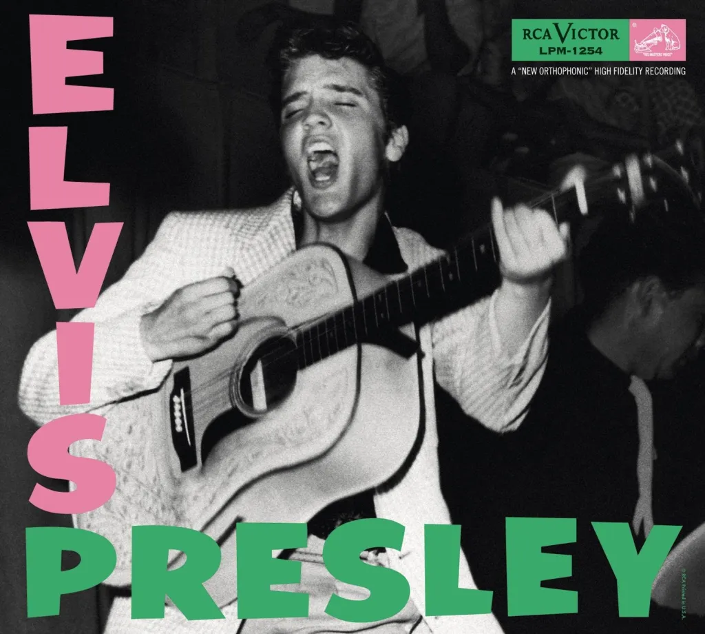
The band did this as a nod to the man that also broke the rules of rock and roll. I found this quote by Paul in regards to the similarities of the covers… “When that Elvis record came out, rock’n’roll was pretty dangerous. And I suppose when we brought out our record, it was pretty dangerous stuff too.”
Last little piece of controversy around the cover is the date that the guitar smashing occurred. The clash played two back to back dates at the Palladium September 20th and 21st of 1979. On the original album sleeve and liner notes showed that the photo was taken at the show on the 21st. The band and record company would continue to use this date as late as 2016, but some detective like fans have gathered proof that the incident actually occurred at the show on the 20th. I will link video in the Liner Notes page if you are interested in seeing the evidence that shows it actually occurred on the 20th.
Not that this date is a big deal by any means…its just an interesting piece of history that might have been recorded wrong and kept that way if someone didn’t dig into it.
Acclaim
The album cover art has been regarded as one of the greatest album covers of all time. Rolling Stone ranked it 8th out of 500 best album covers of all time. Other publications have also listed it very highly as a most influential album cover. The album itself has been inducted into the Grammy Hall of Fame in 2007, and then was profiled by BBC Radio 1 Masterpieces denoting it as one of the most influential albums of all time.
In 1995 former clash member Mick Jones used the same design scheme for the album F-Punk, it was also parodied for the soundtrack to Tony Hawk’s American Wasteland, and many other album covers.

Last but not least the album cover was among ten chosen by Royal Mail (a British postal service and courier company) for a set of "Classic Album Cover" postage stamps issued in January 2010.
My Thoughts
Overall my thoughts on the cover for London Calling…is that the photograph is what makes this cover great. The fact that it is a perfectly timed shot, the raw emotion and frustration of the moment, the blurry unfocused nature of the shot…it all just speaks to the band, the music, and the story of what was happening in that time and place in history. The homage to the King, Elvis Presley album is a nice touch, but I don’t think I would have copied the design as closely as they did. To me it kind of feels like cheating to just use the same design…but I think given the greatness of the album and what it did to music…it works. As always I like to give you some tips on how you can use the concepts of this album cover in your own designs and projects. One of the first things that stands out to me is to not rule out something that isn’t perfect. You might be asking what does that mean…? So the photo itself isn’t perfect. Its blurry, out of focus, and there were probably better looking shots that could have been used for the cover art. But, that was the RIGHT shot for the cover. Trust your gut and don’t let what someone might call an imperfection, stop you from using that image that you know speaks to your project. Now if the image is terrible….don’t use it. The blurry, unfocused nature of this image adds to the story telling for this album.
My second piece of advice would be to look for inspiration in the album covers of your heros….but don’t just out right copy them. I wouldn’t condone doing exactly what the designer did with the London Calling cover, but there are ways to use the elements, colors, etc… from a great album cover to inform the design of your cover. For instance you could use the same colors from the text…but in a new way. What if you used the pink color to tint the image and the green for the text, with a great image…that would be kool and also pay homage to the same cover. Think outside the box, but don’t be afraid to look for inspiration from great covers of the past.
That’s it for the cover art for London Calling by The Clash….what are your thoughts on this album cover…? Would you rate this cover as one of the best of all time…? Let me know in the comments, and or send me a message at info@jwcreates.com.
Lets move on to Near Miss
Near Miss
Today’s near miss is…..interesting….and is more of a who let you name your album that. Not even kidding the name of todays album is - You can tune a piano, but you can’t tuna fish…….This isn’t even some weird obscure band or from a weird genre…there are some songs on this album that I know you have heard probably more than once.

This album came out in 1978 and is the 7th studio album by the band REO Speedwagon. REO as some people will refer to them as is an American rock band that formed in 1967. The band gathered a following in the 70’s, but didn’t hit real commercial success until the 80’s.
The album, can’t tuna fish, was the first album for REO Speedwagon to make the top 40, peaking at number 29, and is registered 2x platinum. The two hits from this album "Time for Me to Fly" and "Roll with the Changes" have since become two of the band's best-known songs.
There are two other bits of accomplishment for this album. In 2005, the album cover was featured on Pitchfork's list of "The Worst Record Covers of All Time", and in 2014 its title was featured in NME's list of "The 50 Worst Album Titles in History". Neither of these surprise me….
In a nut shell this is the album cover….there is a tuna fish with a tuning fork in its mouth, against a bright blue sky and the sun is shining off the shiny tuning fork, and this image is outlined by a white box with the band name up top and the album name at the bottom in a black basic font. Pretty basic layout, and a tuna fish with a tuning fork…..I mean, with that name there isn’t much to work with. So how did they land on that name…?
In a fan Q&A session marking the album’s 45th anniversary, Kevin Cronin said the joke about the difference between a piano and a fish had been told by a friend at an after-show party. "When I heard that punchline I thought, 'That sounds like a good album title. It's outside the box, it's wacky. And the music we'd written for that album was diverse stylistically – we were definitely thinking outside the box. He also added: "To me, the album title should say something about the music on the album. I felt it was a good match and everyone agreed."
During the same Q&A session he was asked if they had a hard time getting the record company on board….and he said "Epic Records, back at that time...was perhaps the most creative, the most artist-friendly label there was. ... When we sent the songs in, they heard the music and they dug it; and so when they got the album title that we were proposing, they were all in from the very beginning."
I know the 70’s was a wierd time…but how did no one stop this from happening?!?!?!
You may be asking Josh, how would you fix this album cover…? #1 you don’t name your album after the punch line of a joke. Especially a joke about the difference between a piano and a tuna fish. I believe they did the best they could given the subject matter given…but even a hand drawn cartoon fish tuning a piano or something like that could have made for a better cover. A literal tune fish, with a tuning fork in its mouth….its just way too literal.
I think my take aways are two fold. 1.) People will agree with your terrible ideas. The fact that it sounds like no one tried to stop this name from happening is a perfect example. 2.) In the case of this album the bad album name and image did not hurt the impact of great music. If your music is great, the imagery isn’t going to hold it back from people loving it. Now this was probably more true when your music was mostly consumed on the radio. Most people probably didn’t see the album cover art for 90% of the music they listened to. To me Its a little different today where we are scrolling through music on a screen or device, and judging it solely on outward appearance most times. But if the music is great, people will listen, even with bad cover art. Please don’t be the person or group with bad cover art, and guessing by the fact that you are hanging out with me here, you don’t want bad cover art either.
So what do you think about the album - You can tune a piano, but you can’t tuna fish…? Do you have any other examples of questionable cover art or album names you would like me to discuss in future episodes…? Let me know in the comments or as always send me message to info@jwcreates.com
That’s it for todays episode of the Judged by the Cover podcast. Don’t forget to like and subscribe wherever you are listening, and I hope you enjoyed talking about these two album covers. If you would like to learn more about me check out my website jwcreates.com, or follow me on Facebook and instagram by searching @jdubcreates.
Have a great day, and let’s do this again very soon.


Comments